Here is some inspiration I found on Pinterest.
I want my website design to be clean, clear and modern.
My website needs to be sophisticated and visual.
My main colour scheme will be black and white but there will be colour too.

This is the homepage to a visual website, the detail around the image is amazing. There isn't too much going on as you are focused in on the image. Again it is simple and the white background makes it look very professional.

I like that this website is set out in a grid layout. It is clear that if you hover over a certain image it will take you to a specific page. This website is very similar to what I would like to achieve.
On this website design I really like the heading. The picture behind the main text and links is strong and makes the website look interesting rather than seeing your usual conventional symbols and writing.

Similar to the image above this website design using an image as its main background. the links are in black and white to make them clear and visible. The image is slightly blurred round the edges so that there isn't a distraction to the website itself. It really works.

I dont like this website that much as it is too plain, I would like my website to be clear and clean but have visuals to make it look intriguing. Some of the website links cover the main image which ruins the theme.

This website design is very girly and pretty. I don't want to achieve a girly website because I need to make sure I attract both male and female to my agency. I may like the look of this website but that isn't what my agency is about, I need to make sure my customer is in my thoughts at all times and my agencies theme shines through the website.

I researching a music website that is laid out in a grid. I like the grid theme and the colours work really well on this page. As the name of the artist is in the same colour as the photo underneath I think it works well to let the audience know what that section or link is all about.

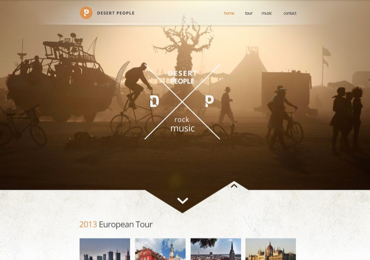
This homepage of a music website is strong due to its amazing graphic logo. However, at a glance I would not have thought it was a website for music. I need to make sure at a first glance my customers and their fans will know exactly what my website represents.


0 comments:
Post a Comment